
Here we are already at the end of the first month of 2016. We’ve taken that deep breath after the holidays and settled down into the new year, ready to move forward.
However, this year isn’t any less crazy than the last one – It’s easy to get anxious and restless and it’s important that our home and our environment calm us down.
A trend this year to help make a difference is in paint color. Color directly affects our state of mind. Bright colors can cheer us up, but some can be too harsh and hostile. Design experts are looking to neutrals, calm pastels and tones of white this year as the color we need to incorporate in key rooms: bedroom, living room, den. These are the places we go to escape the craziness of life. Surround yourself with calm colors and your state of mind will thank you!
From Interior Design Magazine: “Centered around simplicity, serenity and seamlessness, the 2016 interior reflects our need to switch off and detox. Warm but calming colors are complimented by natural textures and soft shapes.”
In a move away from brights to warm hues in 2016, Sherwin-Williams has announced Alabaster (SW 7008), a hue symbolic of new beginnings, as its 2016 Color of the Year. Benjamin Moore, has selected Simply White OC-117 as its 2016 Color of the Year while Valspar paint says that its restorative 2016 color palette called ‘Comfort Zone’ is an antidote to a ‘fast-paced lifestyle’ and will ‘balance the mind, body and spirit.’
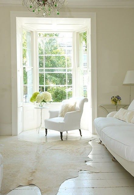
You can never go wrong with shades of white, it’s natural, classic and timeless. It also works with any other color. Try pairing the shades above with pale pinks, soft blues and warm browns. Whites and neutrals work in any situation. Its possible to have sophistication and/or a modern room and still feel the healing abilities of soft and calming colors in your home.
