• About

designstateofmind

~ Interior design IS a state of mind.. Anything you visualize, anything you imagine, anything you want your space to be.

designstateofmind

Tag Archives: Paint colors

Doin’ It Old School!

10 Sunday Jan 2016

Posted by Steven Wallace in Uncategorized

≈ 6 Comments

Tags

architecture, decor, decorating, design blogs, fabric, furniture, home, interior design, lifestyle, living, Paint colors, real estate

At the end of 2014, I decided to close my design business. I felt that maybe I had nothing more to say, that after over 25 years I was not in tune with what was happening in the design industry – so much had changed over the years in the process of how we deal with clients.

I was offered a position with an interior design firm based in San Francisco, a newly created job title that looked to be perfect for me and what I had to bring to the table from my years of experience. I was not hired as a designer, but more on the business end: prospecting, bringing in new clients, marketing, handling social media. As a real people person, I knew I could nail this job: networking, being the “face” of the company and selling it … after all, this was a big aspect of what had made me successful all those years.

From the beginning, the designers approach was not to interact with potential new clients, but have me sign them, collect the retainer, note the clients needs and bring that info to the team. Then the design team would start the process: determining a worksheet of needs, coming up with a concept design, sourcing …  but all of this without ever actually having met the new client or been to the job site. And from there, it was to be handled all by email, texts, video conferencing and linking the client to sites, such as Pinterest, where they could view the sourced furnishings, and make notes.

At first it seemed to me a novel idea, very forward thinking and almost cutting edge in it’s modernness! I signed four new clients in a matter of months and the design firm was thrilled.

But, it didn’t take long before things began to unwind … the new clients were unhappy. They felt they weren’t being heard – “Why couldn’t they actually talk in person to the designers?” Miscommunication became a huge issue, over-designing ran rampant … and it’s not hard to understand how that happened. Personal interaction had disappeared from the process.

I started to get frustrated as well. I had sold our company as being unique and cutting edge, and yet now I was having to defend … and it wasn’t easy to do.

Clients started to leave us.

At a team meeting to discuss this issue, I suggested an actual “in person” meeting … face to face.  How about suggesting a night to come to the job site with pizza, sit down and TALK, see how they react to concepts and ideas … watch the subtle movement of their eyes and follow their body language to understand what was working for them and what was confusing?

And the design team said to me “Wow, that’s so old school!” Later on, when a client requested that they needed just one room spelled out in a way they could follow: what furniture, what paint colors, pricing, time line …  I heard ” Oh, that’s the way it used to be done.”

Needless to say, that fabulous new job at the start of last year didn’t work out. Now, in the beginning of 2016 – I am resurrecting my interior design business. I’ve learned something very important, I guess one of those life lessons you don’t think you need to learn until you do.

I’M DOIN’ IT OLD SCHOOL!

interior design_2

Interacting face to face with clients.  Seeing how they live, entertain, their family interaction. Coming to them with actual fabrics, samples and materials that they can see and touch. We are a tactile people, not everything can be experienced virtually. I want to see their reactions, gauge their responses in person – let them know I am listening and that I get it.

It’s going to be an exciting year for the new and improved Steven Edward Wallace Design. Now I see that I still have something to contribute, that one on one connections still count for a lot, especially in a business as personal and creative as interior design.

So, in 2016, here’s to remembering what still works: personal relationships and never forgetting that often “old school” can be very modern!


Share this:

  • Print
  • Twitter
  • Facebook
  • Email
  • LinkedIn
  • Pinterest

Like this:

Like Loading...

The Colors of Valentine’s Day

13 Friday Feb 2015

Posted by Steven Wallace in Uncategorized

≈ 1 Comment

Tags

decorating, design blogs, Holiday decorating, Houzz, interior design, love, Paint colors, pink, real estate, red, romance, Valentines Day, white

I’ve written before about red and white as colors in your home. Red at Christmas and white in a blog on how to brighten up winter. For Valentine’s Day, I’m adding pink to red and white … so we now have the three colors of this holiday and how they enhance the feelings of love and romance to our space.

RED – When we think of red, we think of bold feelings. Red is the color of passion and action. It can be maddening, angry and crazy… the term “seeing red” means we are really not in our right mind! That’s why it’s a great color for the holiday. Young love, first love, sexual love; when we feel those thoughts we have red on the brain.  On the other hand, when love is in trouble, red pops up again…  blood lust, jealousy and hate are all red related colors. It’s great to use for dramatic effect in a dining room, powder room or bedroom.  Here are my favorite names of paint colors in the red family taken from Benjamin Moore Paints: Drop Dead Gorgeous. My Valentine. Red Lipstick.  If that doesn’t get your heart beating, what does?

PINK – Ahh, pink, the color of blushing, of sunsets, of innocence. Pink is often overlooked as too sappy, to feminine or too pretty to use in a room. But there are many great shades of this color that work in surprising ways. Try adding pink to your palette and to your accents, especially in plaids and stripes. It’s bright, cheerful and so easy to mix with other colors like blues, browns and black. Here are three awesome pinks from the Benjamin Moore collection:  Unspoken Love. Engagement. Sailors Delight. From a hint of blush to fuchsia, painting a room pink just makes a statement!

WHITE – I guess for most people, there is just plain white. We can easily miss out on all the subtle aspects this color can bring to our world. A harsh white can be glaring and cold. If it’s too soft it can be lost or too tinted with beige can look tired and old. But used properly, white is by far the most interesting color for Valentine’s Day. What says more than a dozen white roses? Perfectly nclassic, white is a statement of timeless love. White is for weddings, for that clean minimal look, for celebrating summer. I love an all white room, like an Art Deco movie set: white piano, white carpet, white lacquer tables! How about these from the Benjamin Moore spectrum? White Down. Alabaster. Milky Way.

Add red, pink and white to your home and celebrate your Valentine’s Day colors, whether you are a couple, single or just a fool for love!

Share this:

  • Print
  • Twitter
  • Facebook
  • Email
  • LinkedIn
  • Pinterest

Like this:

Like Loading...

Making The Most Of Winter Light

08 Monday Dec 2014

Posted by Steven Wallace in Uncategorized

≈ 1 Comment

Tags

2014, 2015, @swallacedesign, architecture, Christmas, Happy New Year, Holiday decorating, interior design, Paint colors, real estate, window treatments, winter white

After our recent visit to Scandinavia and seeing how well they cope with short winter days, I learned about Hygge, the art of staying cozy and happy and positive during the winter months.  This is a reprint of an earlier post, but to me, makes even more sense now!

Capture as much light and sun as possible in these 5 easy ways:

1) Grab a Sunny Spot – Pull your favorite chair up to a window or glass door.  Not only can this be your personal refuge for reading or enjoying the change in seasons, the chair captures warmth from what sun there is and makes you feel comforted and safe. Just 30 minutes a day sitting there will give your body the amount of vitamin C it needs to keep your mind alive.

2) Let the Sun Shine In – Open up the window treatments.  Many of us grew up with the concept that to keep the cold out, close blinds and drapes.  This is not only unnecessary but makes our rooms darker and dismal.  If you have double paned windows, you don’t have to worry about heat loss and the morning sun is the best for starting your day off right.  In the winter, take down valances and cornices to expose as much of the window as possible.

3) Winter White – Scandinavians knew the secret to surviving winter darkness.  Living without sun for months on end made them experts.  Their secret was effective use of color.  White painted furniture and white washed walls made any room bright and cheerful, no matter how black the night (or day!).  Use light colors; add white, cream or linen colored pillows and throws around the room.  Ban dark colors until spring.

4) Grow a Winter Garden – You may not be able to plant outdoors, but this is the time for flowers and plants inside.  Succulents in a long wooden bowl in the kitchen window do great and add the green you crave.  Bring home an orchid or bromeliad for the table and watch the smile it brings to your families face.

5) Ban Traditional Christmas Colors –  The holidays don’t always have to be red, green and gold.  Use fresh new colors like fuchsia, aquamarine and orange.  Arrange colored ornaments in a bowl on the kitchen counter.  Using silver keeps your decorating fresh through New Years Eve and stays modern and clean looking right through the season.

Add your personal suggestions below.  Love to hear from you!

Share this:

  • Print
  • Twitter
  • Facebook
  • Email
  • LinkedIn
  • Pinterest

Like this:

Like Loading...

Using Red In Your Holiday Decor

17 Monday Nov 2014

Posted by Steven Wallace in Uncategorized

≈ 3 Comments

Tags

architecture, Christmas, decor, decorating, design blogs, Design Pro, fabric, Holiday decorating, Houzz, interior design, living, Paint colors, real estate, red, steve wallace design, style

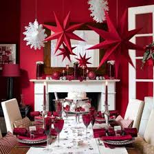
The color red plays an important part in our lives. Red moves us, it’s dramatic and unforgettable. It’s a celebration, passionate and fun. During December, no color in the spectrum is more on display. Santa’s suit, poinsettas, even Rudoplh’s nose. It’s not the color for everyone and needs to be used sparingly, but this season red can be just the right wow factor you are looking for.

Four ways to incorporate red in your design … if you dare!

holiday photo

Sit down on it – I recently had a few yards of the most intense red silk left over from a project. It wasn’t the kind of fabric you could just leave in the closet. I purchased an architectural mid-century wood framed chair at the local consignment store and recovered the seat with this bold shiny red. Living in front of a window, where the sun dances on it, just one piece like this can suddenly become the focal point. But that’s red for you. It loves the attention.

Express yourself – There must be over 100 different shades of red in the paint store. Even the names jump out at you: Confederate Red, Sultan’s Palace, Chili Pepper. Painting an accent wall in one of these can really make a statement .One of my personal favorites is Benjamin Moore Vermilion. It’s a great hue that works well with khaki tans, cool whites and even lime greens, for that knock you off your feet room.

Eat it up – A punch of color is always appropriate on the dining table and red is the perfect compliment here. Whether it’s a mix and match with your fine bone china or layering colored plates, any table will be exciting with a little red thrown in. For the holidays, I love a crisp white tablecloth with red and green stripe napkins. Red is the color of food and I know my appetite is awakened by names like Raspberry, Rhubarb, Cherry and Tomato. When it comes to table decor, you are only limited by your imagination.

Lean on it – Probably the easiest way to make a change to your room is with pillows. They are easy to find and can be as personal as you like. Here is where red can really do its thing. Add brightly colored throw pillows to your sofa or bed. Mix up patterns and shapes. Plaids are really trending right now. My family Scottish plaid is red and yellow. It’s mellow yet royal and looks stunning against off whites and warm browns. Whether you choose linen or leather, red accent pillows update any decor. And the best part is they can be found for very little money, making it easy to change out seasonally.

So whether you are the ravishing red, salsa red or blushing rose type, add a little intensity to your life this holiday. Embrace your personal shade and let it shine. And tell us in the comments section below, what red gets you going?

Share this:

  • Print
  • Twitter
  • Facebook
  • Email
  • LinkedIn
  • Pinterest

Like this:

Like Loading...

Is Your Home Haunted?

30 Thursday Oct 2014

Posted by Steven Wallace in Uncategorized

≈ 3 Comments

Tags

color, design blogs, DesignPro, haunted house, home, Houzz, interior design, Paint colors, real estate

Many of us live in a haunted house and don’t even realize it.  I don’t mean haunted in the traditional sense; like the kind you go to on Halloween or an abandoned mansion you may see in the movies.  But, our homes can be and often are haunted by the ghosts of our own furnishings.  We tend to keep possessions and stuff we don’t really need anymore.  Look around you…  do you still need to display that trinket you bought on your vacation in 1985?  How about the framed wall hanging that says “Have A Nice Day” your Aunt Ruth gave you for a housewarming gift when you moved in 20 years ago?  It’s time to go through and refresh your accessories.  Edit out what’s old and just a dust collector.  Arrange like things that are precious to you in a collection, not spread over every surface.image

Another way you may be living in the past is your upholstery.  When was the last time you had those chairs recovered?  Maybe it’s time to stop living with what you liked when you first moved in and just haven’t really looked at in many years.  Over time, upholstery fades and discolors.  Wear and tear from a busy family really can take its toll on furniture.  Paint colors will change over time and can look dreary and drab.  Try freshening up those rooms with a modern color or new wallpaper.

Pictures and artwork can also really make your home feel dated and old.  Your tastes have probably changed, you might like abstracts now but just can’t part with the landscape you bought at a garage sale a few years back. Maybe there is art you’ve had since college, and it has memories.  But those memories might be holding you back, keeping you in the past.. when you should be looking to the future.

It’s easy to go day-to-day thinking that next year you’ll buy a new sofa, or paint the den or have that painting reframed.  But days turn into months and months into years, and before you know it.. you are living in a home from yesteryear.. Yes, a haunted house!  Haunted by old, used and sad furnishings and colors.  Make a change before those ghosts decide to just take over.

Oh, and be spooked by a real haunted house.  Happy Halloween!

Share this:

  • Print
  • Twitter
  • Facebook
  • Email
  • LinkedIn
  • Pinterest

Like this:

Like Loading...

Blog at WordPress.com.

Cancel

 
Loading Comments...
Comment
    ×
    loading Cancel
    Post was not sent - check your email addresses!
    Email check failed, please try again
    Sorry, your blog cannot share posts by email.
    Privacy & Cookies: This site uses cookies. By continuing to use this website, you agree to their use.
    To find out more, including how to control cookies, see here: Cookie Policy
    %d bloggers like this: