• About

designstateofmind.org

~ Design Inspiration for the modern life.

designstateofmind.org

Category Archives: Uncategorized

The Colors of Valentine’s Day

13 Friday Feb 2015

Posted by Steven Wallace in Uncategorized

≈ 1 Comment

Tags

decorating, design blogs, Holiday decorating, Houzz, interior design, love, Paint colors, pink, real estate, red, romance, Valentines Day, white

I’ve written before about red and white as colors in your home. Red at Christmas and white in a blog on how to brighten up winter. For Valentine’s Day, I’m adding pink to red and white … so we now have the three colors of this holiday and how they enhance the feelings of love and romance to our space.

RED – When we think of red, we think of bold feelings. Red is the color of passion and action. It can be maddening, angry and crazy… the term “seeing red” means we are really not in our right mind! That’s why it’s a great color for the holiday. Young love, first love, sexual love; when we feel those thoughts we have red on the brain.  On the other hand, when love is in trouble, red pops up again…  blood lust, jealousy and hate are all red related colors. It’s great to use for dramatic effect in a dining room, powder room or bedroom.  Here are my favorite names of paint colors in the red family taken from Benjamin Moore Paints: Drop Dead Gorgeous. My Valentine. Red Lipstick.  If that doesn’t get your heart beating, what does?

PINK – Ahh, pink, the color of blushing, of sunsets, of innocence. Pink is often overlooked as too sappy, to feminine or too pretty to use in a room. But there are many great shades of this color that work in surprising ways. Try adding pink to your palette and to your accents, especially in plaids and stripes. It’s bright, cheerful and so easy to mix with other colors like blues, browns and black. Here are three awesome pinks from the Benjamin Moore collection:  Unspoken Love. Engagement. Sailors Delight. From a hint of blush to fuchsia, painting a room pink just makes a statement!

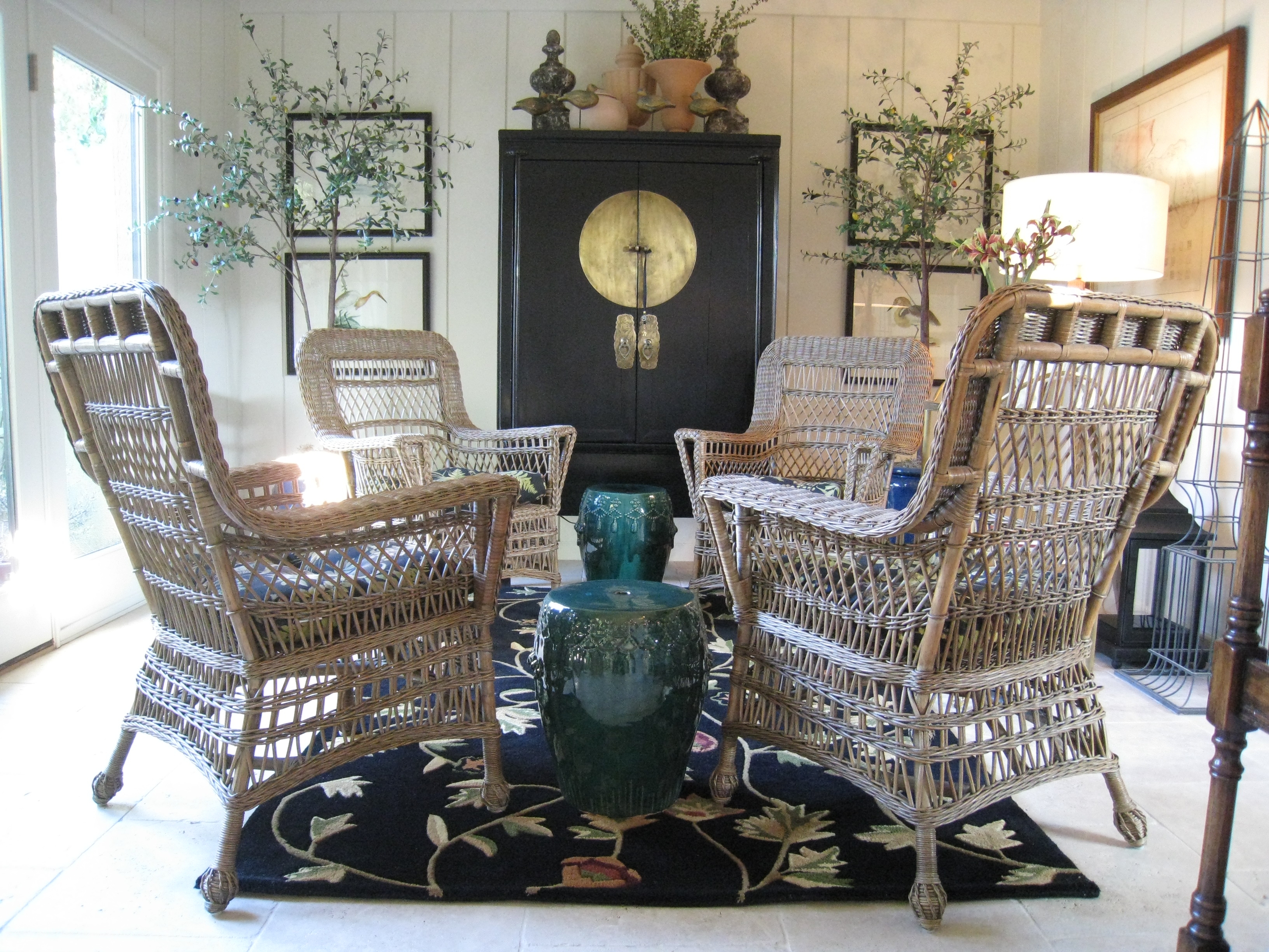
WHITE – I guess for most people, there is just plain white. We can easily miss out on all the subtle aspects this color can bring to our world. A harsh white can be glaring and cold. If it’s too soft it can be lost or too tinted with beige can look tired and old. But used properly, white is by far the most interesting color for Valentine’s Day. What says more than a dozen white roses? Perfectly nclassic, white is a statement of timeless love. White is for weddings, for that clean minimal look, for celebrating summer. I love an all white room, like an Art Deco movie set: white piano, white carpet, white lacquer tables! How about these from the Benjamin Moore spectrum? White Down. Alabaster. Milky Way.

Add red, pink and white to your home and celebrate your Valentine’s Day colors, whether you are a couple, single or just a fool for love!

Share this:

  • Click to print (Opens in new window) Print
  • Click to share on X (Opens in new window) X
  • Click to share on Facebook (Opens in new window) Facebook
  • Click to email a link to a friend (Opens in new window) Email
  • Click to share on LinkedIn (Opens in new window) LinkedIn
  • Click to share on Pinterest (Opens in new window) Pinterest
Like Loading...

Get Your Home Ready For Spring!

27 Tuesday Jan 2015

Posted by Steven Wallace in Uncategorized

≈ Leave a comment

Although for many on the East Coast and the Midwest, spring seems a long way off, here in California we are already experiencing warmer days, more sunshine and “spring fever”. I know I’m ready to pull up the blinds and open the windows and let the light and fresh air in.

Your home may also feel that it’s tired of winter and wants to breath. Now is the time to look at ways to add freshness and vigor to your rooms and embrace the change of seasons.  Here are 3 great ideas that will chase away winter and get your home ready:

1) Put away that old heavy comforter and invest in a brightly colored throw or coverlet for the bed. This season I’m seeing a whole new approach to prints and patterns. Stripes are always easy to mix and match with solid sheets and fun flower patterns reminiscent of the 1970’s are crazy fun and will add a smile to your face.

2) Pull out glass containers, vases and bowls. Here again, color is what’s happening. Don’t be afraid to experiment. In a garden window mix canary yellow, apple green and melon orange glass objects in different sizes.  Don’t worry yet about adding flowers or fruit to the bowls and vases, let their color and shape alone be the interest factor.

3) One of my new passions are picture frames. So many of us put a photo from a holiday or vacation in a frame and there it sits, growing stale, for years and years.  Take a good look at your frames, whether they are on a shelf or the piano.  Discard dark colors and heavy woods and replace them with shell borders, glass on glass and brightly hued plastics. Not only will you see those photos in a new light, but the patterns and colors will brighten up the whole room.

It’s almost February….  Can you see and feel the smell in the air?  Spring is right around the corner, and you’ll be ready!

Share this:

  • Click to print (Opens in new window) Print
  • Click to share on X (Opens in new window) X
  • Click to share on Facebook (Opens in new window) Facebook
  • Click to email a link to a friend (Opens in new window) Email
  • Click to share on LinkedIn (Opens in new window) LinkedIn
  • Click to share on Pinterest (Opens in new window) Pinterest
Like Loading...

Making The Most Of Winter Light

08 Monday Dec 2014

Posted by Steven Wallace in Uncategorized

≈ 1 Comment

Tags

2014, 2015, @swallacedesign, architecture, Christmas, Happy New Year, Holiday decorating, interior design, Paint colors, real estate, window treatments, winter white

After our recent visit to Scandinavia and seeing how well they cope with short winter days, I learned about Hygge, the art of staying cozy and happy and positive during the winter months.  This is a reprint of an earlier post, but to me, makes even more sense now!

Capture as much light and sun as possible in these 5 easy ways:

1) Grab a Sunny Spot – Pull your favorite chair up to a window or glass door.  Not only can this be your personal refuge for reading or enjoying the change in seasons, the chair captures warmth from what sun there is and makes you feel comforted and safe. Just 30 minutes a day sitting there will give your body the amount of vitamin C it needs to keep your mind alive.

2) Let the Sun Shine In – Open up the window treatments.  Many of us grew up with the concept that to keep the cold out, close blinds and drapes.  This is not only unnecessary but makes our rooms darker and dismal.  If you have double paned windows, you don’t have to worry about heat loss and the morning sun is the best for starting your day off right.  In the winter, take down valances and cornices to expose as much of the window as possible.

3) Winter White – Scandinavians knew the secret to surviving winter darkness.  Living without sun for months on end made them experts.  Their secret was effective use of color.  White painted furniture and white washed walls made any room bright and cheerful, no matter how black the night (or day!).  Use light colors; add white, cream or linen colored pillows and throws around the room.  Ban dark colors until spring.

4) Grow a Winter Garden – You may not be able to plant outdoors, but this is the time for flowers and plants inside.  Succulents in a long wooden bowl in the kitchen window do great and add the green you crave.  Bring home an orchid or bromeliad for the table and watch the smile it brings to your families face.

5) Ban Traditional Christmas Colors –  The holidays don’t always have to be red, green and gold.  Use fresh new colors like fuchsia, aquamarine and orange.  Arrange colored ornaments in a bowl on the kitchen counter.  Using silver keeps your decorating fresh through New Years Eve and stays modern and clean looking right through the season.

Add your personal suggestions below.  Love to hear from you!

Share this:

  • Click to print (Opens in new window) Print
  • Click to share on X (Opens in new window) X
  • Click to share on Facebook (Opens in new window) Facebook
  • Click to email a link to a friend (Opens in new window) Email
  • Click to share on LinkedIn (Opens in new window) LinkedIn
  • Click to share on Pinterest (Opens in new window) Pinterest
Like Loading...

Using Red In Your Holiday Decor

17 Monday Nov 2014

Posted by Steven Wallace in Uncategorized

≈ 3 Comments

Tags

architecture, Christmas, decor, decorating, design blogs, Design Pro, fabric, Holiday decorating, Houzz, interior design, living, Paint colors, real estate, red, steve wallace design, style

The color red plays an important part in our lives. Red moves us, it’s dramatic and unforgettable. It’s a celebration, passionate and fun. During December, no color in the spectrum is more on display. Santa’s suit, poinsettas, even Rudoplh’s nose. It’s not the color for everyone and needs to be used sparingly, but this season red can be just the right wow factor you are looking for.

Four ways to incorporate red in your design … if you dare!

holiday photo

Sit down on it – I recently had a few yards of the most intense red silk left over from a project. It wasn’t the kind of fabric you could just leave in the closet. I purchased an architectural mid-century wood framed chair at the local consignment store and recovered the seat with this bold shiny red. Living in front of a window, where the sun dances on it, just one piece like this can suddenly become the focal point. But that’s red for you. It loves the attention.

Express yourself – There must be over 100 different shades of red in the paint store. Even the names jump out at you: Confederate Red, Sultan’s Palace, Chili Pepper. Painting an accent wall in one of these can really make a statement .One of my personal favorites is Benjamin Moore Vermilion. It’s a great hue that works well with khaki tans, cool whites and even lime greens, for that knock you off your feet room.

Eat it up – A punch of color is always appropriate on the dining table and red is the perfect compliment here. Whether it’s a mix and match with your fine bone china or layering colored plates, any table will be exciting with a little red thrown in. For the holidays, I love a crisp white tablecloth with red and green stripe napkins. Red is the color of food and I know my appetite is awakened by names like Raspberry, Rhubarb, Cherry and Tomato. When it comes to table decor, you are only limited by your imagination.

Lean on it – Probably the easiest way to make a change to your room is with pillows. They are easy to find and can be as personal as you like. Here is where red can really do its thing. Add brightly colored throw pillows to your sofa or bed. Mix up patterns and shapes. Plaids are really trending right now. My family Scottish plaid is red and yellow. It’s mellow yet royal and looks stunning against off whites and warm browns. Whether you choose linen or leather, red accent pillows update any decor. And the best part is they can be found for very little money, making it easy to change out seasonally.

So whether you are the ravishing red, salsa red or blushing rose type, add a little intensity to your life this holiday. Embrace your personal shade and let it shine. And tell us in the comments section below, what red gets you going?

Share this:

  • Click to print (Opens in new window) Print
  • Click to share on X (Opens in new window) X
  • Click to share on Facebook (Opens in new window) Facebook
  • Click to email a link to a friend (Opens in new window) Email
  • Click to share on LinkedIn (Opens in new window) LinkedIn
  • Click to share on Pinterest (Opens in new window) Pinterest
Like Loading...

Is Your Home Haunted?

30 Thursday Oct 2014

Posted by Steven Wallace in Uncategorized

≈ 3 Comments

Tags

color, design blogs, DesignPro, haunted house, home, Houzz, interior design, Paint colors, real estate

Many of us live in a haunted house and don’t even realize it.  I don’t mean haunted in the traditional sense; like the kind you go to on Halloween or an abandoned mansion you may see in the movies.  But, our homes can be and often are haunted by the ghosts of our own furnishings.  We tend to keep possessions and stuff we don’t really need anymore.  Look around you…  do you still need to display that trinket you bought on your vacation in 1985?  How about the framed wall hanging that says “Have A Nice Day” your Aunt Ruth gave you for a housewarming gift when you moved in 20 years ago?  It’s time to go through and refresh your accessories.  Edit out what’s old and just a dust collector.  Arrange like things that are precious to you in a collection, not spread over every surface.image

Another way you may be living in the past is your upholstery.  When was the last time you had those chairs recovered?  Maybe it’s time to stop living with what you liked when you first moved in and just haven’t really looked at in many years.  Over time, upholstery fades and discolors.  Wear and tear from a busy family really can take its toll on furniture.  Paint colors will change over time and can look dreary and drab.  Try freshening up those rooms with a modern color or new wallpaper.

Pictures and artwork can also really make your home feel dated and old.  Your tastes have probably changed, you might like abstracts now but just can’t part with the landscape you bought at a garage sale a few years back. Maybe there is art you’ve had since college, and it has memories.  But those memories might be holding you back, keeping you in the past.. when you should be looking to the future.

It’s easy to go day-to-day thinking that next year you’ll buy a new sofa, or paint the den or have that painting reframed.  But days turn into months and months into years, and before you know it.. you are living in a home from yesteryear.. Yes, a haunted house!  Haunted by old, used and sad furnishings and colors.  Make a change before those ghosts decide to just take over.

Oh, and be spooked by a real haunted house.  Happy Halloween!

Share this:

  • Click to print (Opens in new window) Print
  • Click to share on X (Opens in new window) X
  • Click to share on Facebook (Opens in new window) Facebook
  • Click to email a link to a friend (Opens in new window) Email
  • Click to share on LinkedIn (Opens in new window) LinkedIn
  • Click to share on Pinterest (Opens in new window) Pinterest
Like Loading...

Be Inspired to Design!

30 Tuesday Sep 2014

Posted by Steven Wallace in Uncategorized

≈ Leave a comment

It’s easy to say that inspiration is all around us, and of course it is. But often we may find it hard to translate that into our living environment. We look at our home and don’t know where to start. It’s important to find that something special that speaks to us and our vision and complete the interior we desire.

Everything in your home can be a source of inspiration. The idea for a room often begins with a single object: a family heirloom, a framed photo, a piece of fabric, that Merlot in your glass. Start from that single element that you love and watch the space take shape.

Even beyond that, inspiration can often be more obvious than you realize. That vacation you took last year to the beach or a visit to your local museum. The color of the sky or the leaves on a tree. Smell and sound can bring an idea to your mind. Music can inspire you visually. A song can bring the power to energize your space or be soothing and peaceful, and your home will reflect this.

I have helped clients create children’s rooms inspired by fairy tales or sports teams. We have painted stars and moons on ceilings of nurseries. A master suite enveloped in fabric can be a Moroccan fantasy and a South Seas paradise can be achieved by finding that right shade of blue you saw in Tahiti.  Anything is possible and the possibilities are endless.

JPHouse6

Once you have landed on your inspiration, don’t feel pressured to move quickly. Let a room take shape naturally. It may take time for the elements to fuse together. Don’t be disillusioned or frustrated just because you have the perfect red pillow but aren’t finding the sofa fabric to go with it. Keep an open mind, let the inspiration flow and allow the space to speak to you.

Finally, don’t be afraid to do the unexpected. It’s OK to take risks. Keep an open mind about your room and what it may be saying to you. Discover the hidden texture or spot of brilliance in your personal inspiration. Don’t be boxed in my convention!

I always try to help clients move just a bit further from their comfort zone. A home should be a personal statement.  Your finished space, if you let it, will spring from your inspiration and may just be the impetus for someone else’s imagination.

Share this:

  • Click to print (Opens in new window) Print
  • Click to share on X (Opens in new window) X
  • Click to share on Facebook (Opens in new window) Facebook
  • Click to email a link to a friend (Opens in new window) Email
  • Click to share on LinkedIn (Opens in new window) LinkedIn
  • Click to share on Pinterest (Opens in new window) Pinterest
Like Loading...

Have we finally seen the death of Mid Century Modern?

24 Thursday Jul 2014

Posted by Steven Wallace in Uncategorized

≈ 2 Comments

For a few years now I’ve been saying that Mid Century Modern is over. The look that took Palm Springs and the rest of the country by storm may finally be breathing its last breath. And as far as I’m concerned it’s time.

In the last decade, interior designers, architects and the public found that the style and character of design from the middle of the 20th century was being lost or ignored. Some great furniture and buildings were forgotten and sadly, in disrepair. A few brave souls brought this to our attention, especially in southern California where the look was born and bred. Suddenly, everyone got on board. Homes from the 1960s began selling like hotcakes. Eames and other furniture designers were finally getting their due respect and it was a great thing. Mad Men came along, and BAM!… the nation was hooked and addicted.  I don’t think I’ve ever seen a style move through the population with such a vengeance!

modernart3

But we are a fickle people, and fads come and go, especially those that become overworked and overdone, like this has. When was the last time you saw an original take on this classic style? Walking the streets of Palm Springs, California or going into the many shops and stores that have fed into the frenzy, it suddenly become refreshing to see a front door that isn’t painted orange, or a living room without a white shag rug and satellite shaped clock on the wall. Is it some kind of longing for our childhood? I think it’s time for us to just say “no”, let the 1960s go and move on.

Its become, in the words of Antiques dealer Richard Shapiro ” the monotony of one mid-century room after another, predictable, gratuitous, with gimmicky accessories.” Have we forgotten to embrace that wonderful concept “eclectic”? I believe we have forsaken the pedigree found in the best of Mid Century Design and lost ourselves in the trend. Will we look back soon and laugh at ourselves and our homes like we do now with the Santa Fe or Tuscan look we once latched on to, much to our embarrassment?

I know that I will now be an outcast in Palm Springs..  I might need to keep an eye on my back. But, I am hoping that we soon start to cut back on this look. Use it sparingly. Remember the great bones of Mid Century design but stop romanticizing it. Everything in moderation, my friends. Love it, use it, but maybe give it a much deserved rest?


Share this:

  • Click to print (Opens in new window) Print
  • Click to share on X (Opens in new window) X
  • Click to share on Facebook (Opens in new window) Facebook
  • Click to email a link to a friend (Opens in new window) Email
  • Click to share on LinkedIn (Opens in new window) LinkedIn
  • Click to share on Pinterest (Opens in new window) Pinterest
Like Loading...

How To Live In A Home, Not A House!

20 Friday Jun 2014

Posted by Steven Wallace in Uncategorized

≈ Leave a comment

Tags

color, decor, design blogs, DesignPro, family rooms, furniture, Houzz, interior design, living

Life today is like a roller coaster – full of ups and downs and periods of suspense. Our home, then, more than ever before, should serve as our shelter, a safe refuge from the alarms of an uncertain world. That’s something we all know. But there is much more than that…

The pleasant background you have created is only half the job. Have you created something that reflects your taste and personality and that contributes to your happiness? Oddly enough, happiness and graciousness in home life can be achieved only through constant daily effort. Your measure of success will depend on your degree of civilization. Only the house that is planned in advance and designed soundly, step by step with an eye to a perfect balance will turn out successfully. But the house you decorate will be a dead thing, unless it is a house where people LIVE!  Activity is an essential part of an attractive house.

I have gone into houses that make me want to turn and run. These are the homes that are thought of only as a place to eat and sleep or a house that has been decorated for pure display. Your home should mean something to you. It’s a basic instinct. A home with a life that centers on food and sleep is not really a home, it’s a house. Beauty and graciousness, joy of living, being used in every part, these are the things that make a house a home. A house, like a dog, must be loved before it will show the best side of it’s nature.

Don’t fall for believing a great decor is one derived straight from a catalog or a picture online. Don’t feel that you have to follow rules or keep to the vignette you see at the furniture store.  Give your home your own spin, your uniqueness. Your home is not just a house.. it’s who you are and should say so. The most comfortable homes are the ones that look lived in, that feel as familiar as an old blanket. A guest should be able to walk in and know this is your home, this is your life, this is your family!ImageImage

The two rooms above look to me like homes that are beautiful and well designed, yet show the owners personality and vitality. They are cozy, yet warm; colorful yet peaceful. Find the things in life that make you happy and incorporate them into your living, into your home. Have fun!


Share this:

  • Click to print (Opens in new window) Print
  • Click to share on X (Opens in new window) X
  • Click to share on Facebook (Opens in new window) Facebook
  • Click to email a link to a friend (Opens in new window) Email
  • Click to share on LinkedIn (Opens in new window) LinkedIn
  • Click to share on Pinterest (Opens in new window) Pinterest
Like Loading...

It’s Easy To Downsize!

24 Thursday Apr 2014

Posted by Steven Wallace in Uncategorized

≈ 1 Comment

I’m downsizing from a large home to a condo. HELP!

In the recent economic turn down, it became more common for people to scale back their lifestyles and for many this meant a smaller space. Empty-nesters also face the issue of how to adjust from a five bedroom home to a condo. The first thing to do is be very honest with your self. What do you have to keep and what can go? Many of us become pack rats after many years of living in a large home. Do you really need that much stuff?

Measure your existing furniture, using only what you are sure fits in the new rooms. Purchase sofas that are sized for this kind of space. Many manufacturers make “apartment” or “mid-size” sofas. Buy upholstered pieces with a narrower silhouette, not big rolled arms. You’d be amazed how often you can actually achieve MORE sitting area in the same footprint by using English or track arm sofas that have a width of about four inches. I also always like to use rolling ottomans and stools. They can go anywhere for extra seating and when not in use store under a console or cocktail table.

Use every available space!  Open up under stairwells for storage. Build shelves to the ceiling.  In bathrooms, cut out niches in the walls and in the shower area for display of soaps, candles and towels. Beds with built in drawers saves space when there isn’t room tof it in a dresser.

Use less furniture but make it work harder. Look at drop leaf dining room tables that seat four daily, but can open up to accommodate more on special occasions. Use the center island as a buffet. The second bedroom in a condo can do triple duty as a den/guest room/office. Don’t be boxed in by rules. Rooms don’t need labels. This is where the old adage “less is more” comes in. Make it your motto!

500_ideas_for_small_spaces

There are many great books on the subject as well as a renewed interest today in building smaller houses and how to live in 100-200 square feet.  With a little ingenuity and creativity it can be fun!

Share this:

  • Click to print (Opens in new window) Print
  • Click to share on X (Opens in new window) X
  • Click to share on Facebook (Opens in new window) Facebook
  • Click to email a link to a friend (Opens in new window) Email
  • Click to share on LinkedIn (Opens in new window) LinkedIn
  • Click to share on Pinterest (Opens in new window) Pinterest
Like Loading...

Interior Design As Seen On TV

15 Tuesday Apr 2014

Posted by Steven Wallace in Uncategorized

≈ Leave a comment

Do you ever look at a house on TV and wish it was yours? Do you want to decorate your home to look like one you saw on the small screen? How we see others live on television shapes how we see our own homes, what we aspire to and offers a possible blueprint for perfect living.

In the 1950’s, no longer did we have to leave the comfort of our own easy chairs to get a peek at the neighbors. We could compare and contrast our spaces with other families, from Ozzie and Harriet to The Dick Van Dyke Show. The middle class was in, family and suburban life was on the rise. We moved from more formal homes to tract houses and twin beds.

The mid-60’s even reinforced the concept that we want what we see on TV with Bewitched and the nosy neighbor Gladys Kravitz.  Samantha and Darrin were modern, fun and seemed to live in the perfect house.

BBhouseIn the 70s, The Brady Bunch was the epitome of upscale California suburban living. Arguably the most recognizable house on TV, the stone planter, open stairway and orange laminate counters were mimicked by builders and designers for years.

By the 80s, shows like Dallas, Falcon Crest and Dynasty depicted a more opulent lifestyle, while The Golden Girls put hip Florida senior living on the map.

In the 2000’s, Mad Men about the advertising industry in the 1960s, brings us back to Mid-Century modern decor. They do a remarkable job of re-creating the time and romanticizing days gone by. By enjoying these interiors, we see a strong example of how trends and styles recycle. We’ve gone full circle from the 60’s back to todays home.

Over the years, interiors on TV have shown us simplicity, glamour and reality as well as iconic rooms and design disasters. We have been given rooms to admire, color palettes to copy and the diversity of our own lives. Our homes and lifestyle has been reflected through the lens in subliminal messages of how we should live.

Television has given us many memorable rooms from The Mary Tyler Moore Show single woman apartment, to the mess of Rosanne to the grandeur of Downton Abbey.

So whether you are a Don Draper, miss your Brady Bunch childhood or still like to fantasize about the homes of the uber-rich, the line between our lives and the media has shrunk.

Share this:

  • Click to print (Opens in new window) Print
  • Click to share on X (Opens in new window) X
  • Click to share on Facebook (Opens in new window) Facebook
  • Click to email a link to a friend (Opens in new window) Email
  • Click to share on LinkedIn (Opens in new window) LinkedIn
  • Click to share on Pinterest (Opens in new window) Pinterest
Like Loading...
← Older posts
Newer posts →

Create a free website or blog at WordPress.com.

Privacy & Cookies: This site uses cookies. By continuing to use this website, you agree to their use.
To find out more, including how to control cookies, see here: Cookie Policy
  • Subscribe Subscribed
    • designstateofmind.org
    • Join 61 other subscribers
    • Already have a WordPress.com account? Log in now.
    • designstateofmind.org
    • Subscribe Subscribed
    • Sign up
    • Log in
    • Report this content
    • View site in Reader
    • Manage subscriptions
    • Collapse this bar
 

Loading Comments...
 

    %d